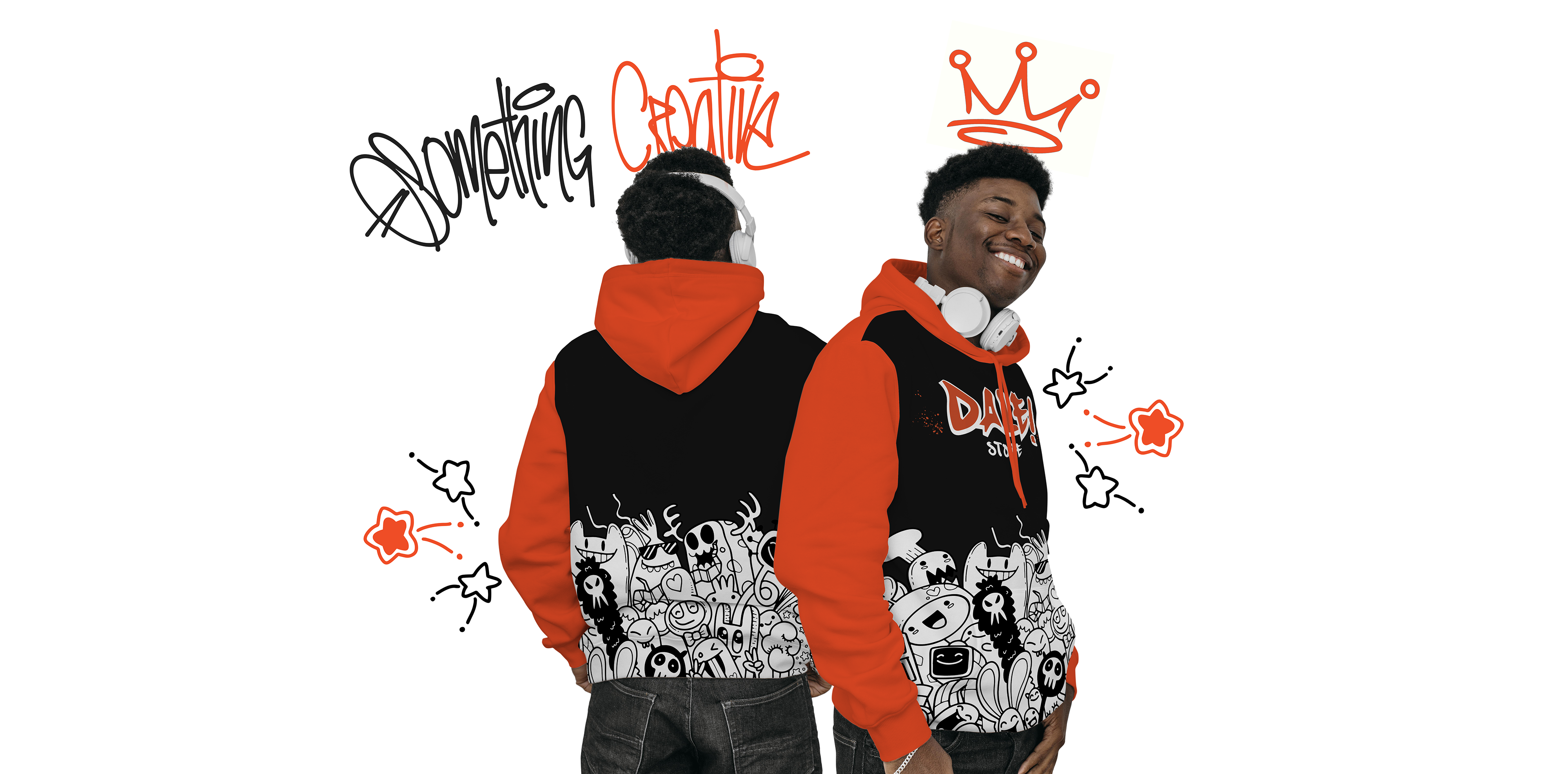
A Dale! Store é uma loja alternativa com foco no estilo streetwear. O nome da marca surgiu da expressão “Dale”, um neologismo em português usado para representar comemoração.
A loja se trata de uma loja virtual, mas existem planos de expandir o negócio para um espaço físico com uma nova linha de produtos esportivos voltada para o skateboard e patinação. O espaço vai ser planejado com uma estrutura bem moderna para que os clientes se sintam em casa quando estiverem na loja.
O público alvo principal da loja são jovens e adolescentes, fãs do estilo urbano. A marca conta com uma linha masculina e feminina, mas os produtos em sua grande maioria são unissex, o que torna esse público bem misto com relação a gênero.


ABOUT
The “Dale! Store” is an alternative store focusing on the streetwear style.The brand’s name emerged from the expression “Dale”, a portuguese neologism used to represent celebration.
The store is an e-commerce, but the owners have plans to expand the business to a physical store, with a new line of sportive products turned to skateboarding and skating. The space will count with a modern structure so the clients feel at home when they are in the store.
The main target audience of the store are young adults, teenagers and urban style fans. The brand has feminine and masculine lines, but most of the products are unissex, which enables a very gender mixed audience.
RASCUNHOS
Para trazer o estilo urbano para a marca buscamos referências no grafitti, e para isso a tipografia manual não podia ficar de fora. Nos primeiros rascunhos, nós criamos uma fonte exclusiva para o logotipo da marca.
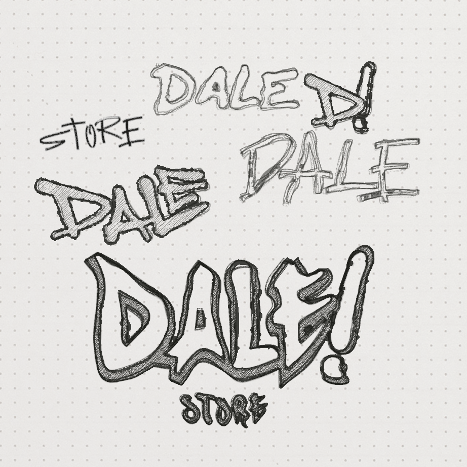
SKETCHES
To bring the urban style to the brand we searched for references in Grafitti, and for that the handwritten typography couldn’t be left out. In the first sketches we created an exclusive font for the brand’s logotype.
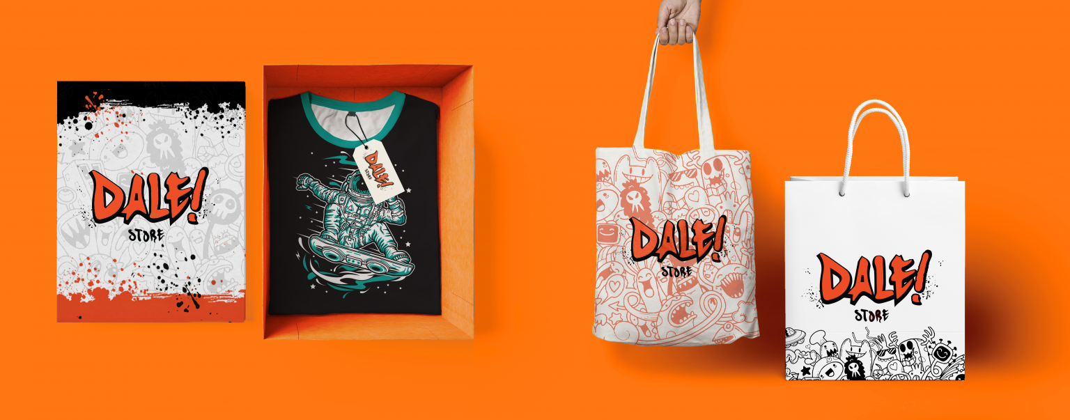
CORES
As cores usadas na marca foram o laranja e o preto, que tem um contraste forte e marcante. O laranja trouxe um aspecto energético para a marca.
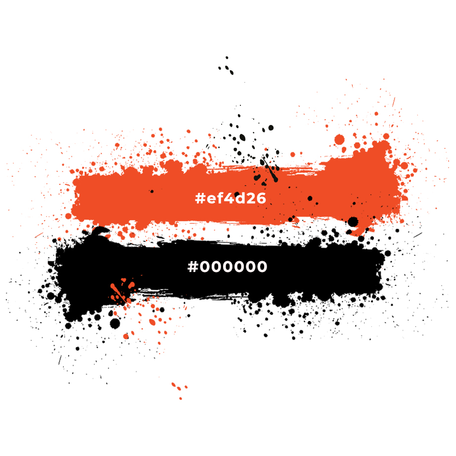
COLORS
The colors used for the brand are orange and black, which have a strong and memorable contrast. The orange brings an energetic aspect to the brand.
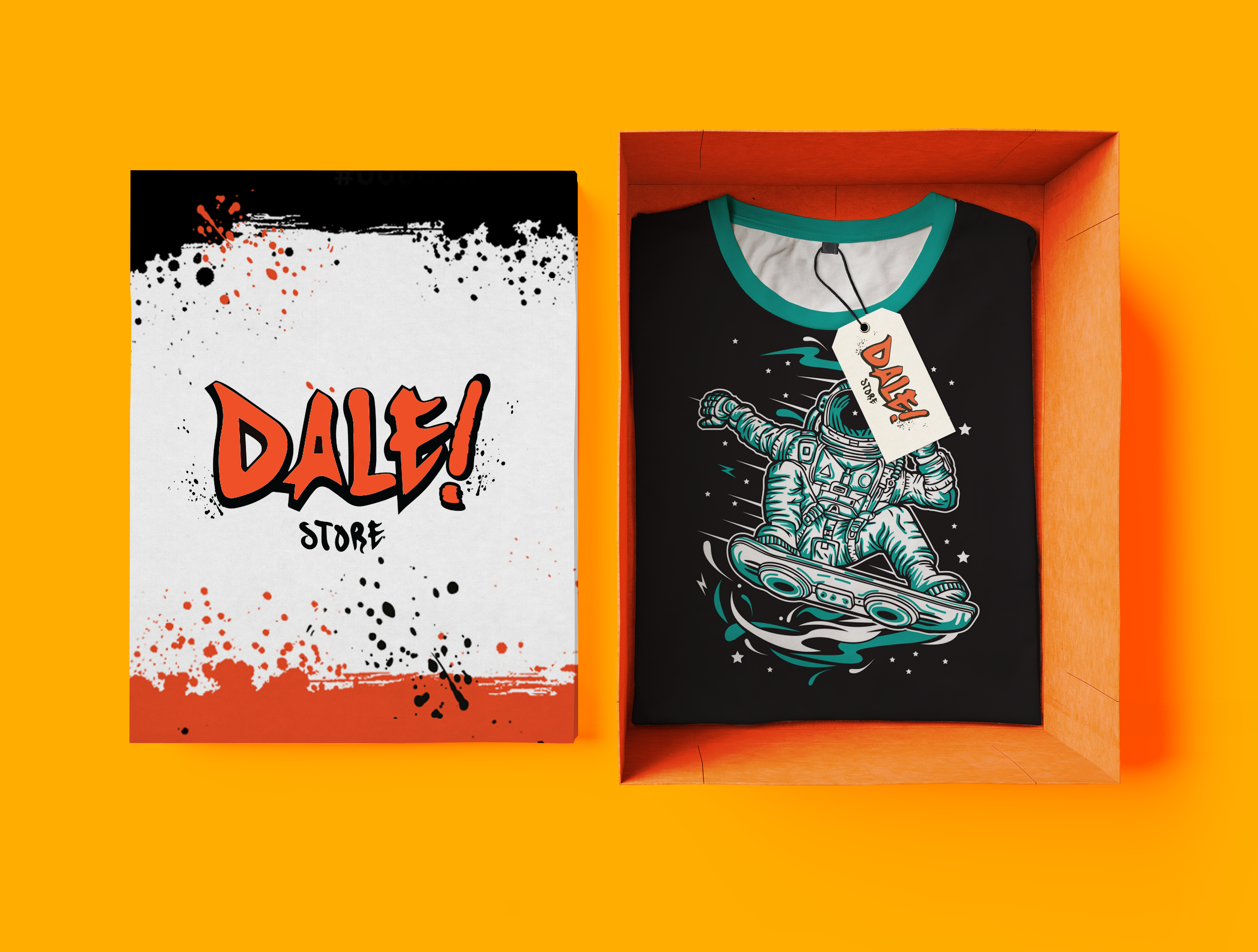
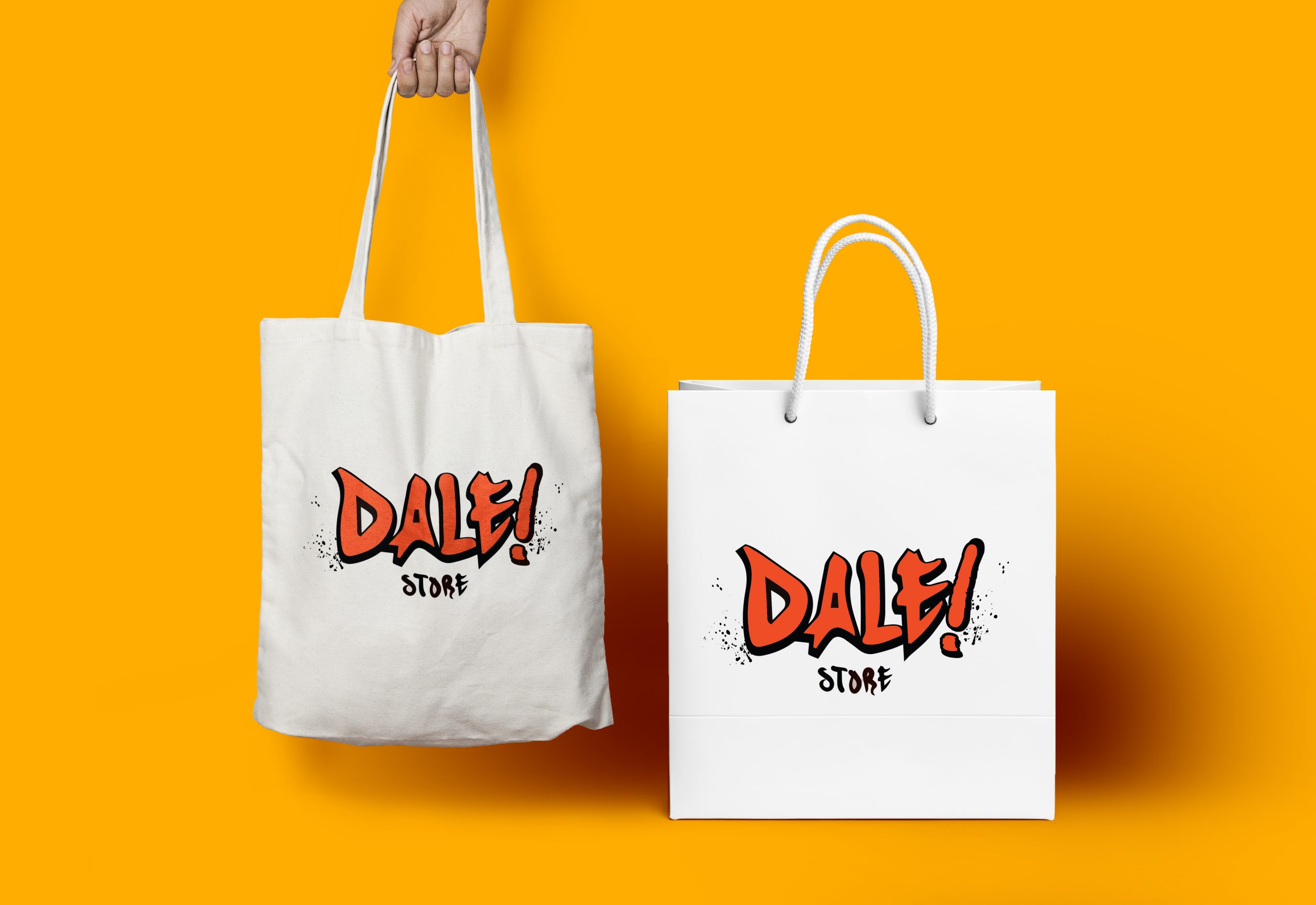
LOGOTIPO
O modelo de marca escolhido conta com sua versão positiva e negativa, e o uso dessas variações é definido de acordo com os parâmetros definidos no Manual da marca.
LOGOTYPE
The chosen model counts with its positive and negative versions, and the use of these variations are according to the parameters defined in the brand manual.
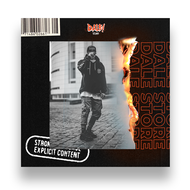
SOCIAL MEDIA
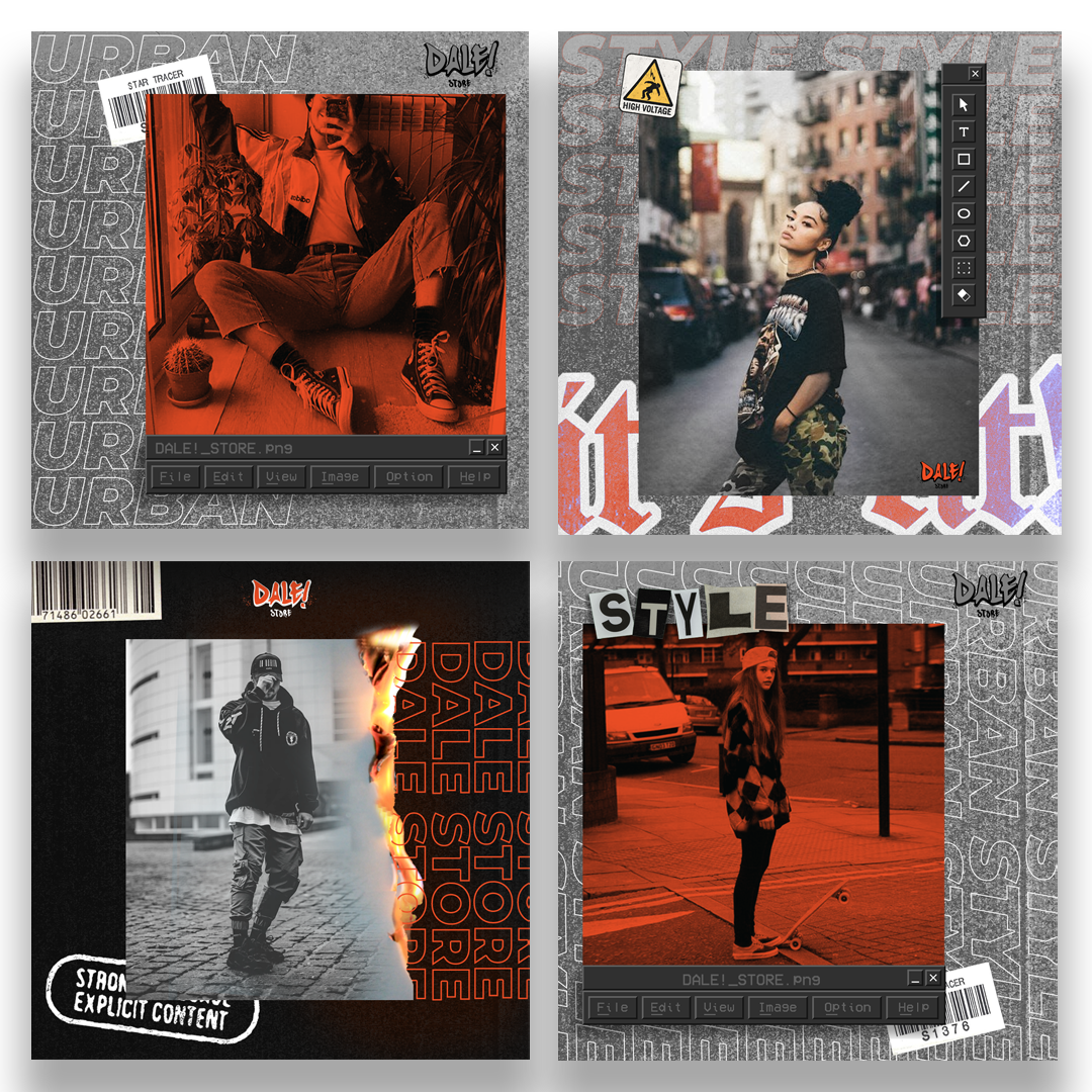
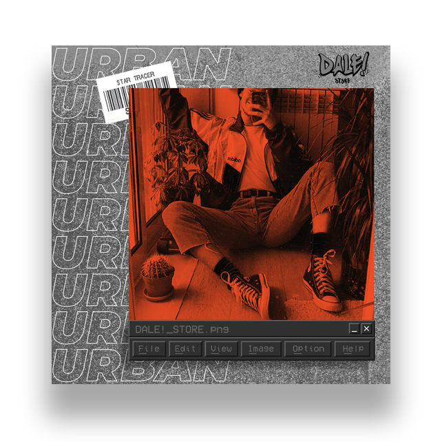
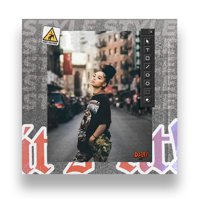
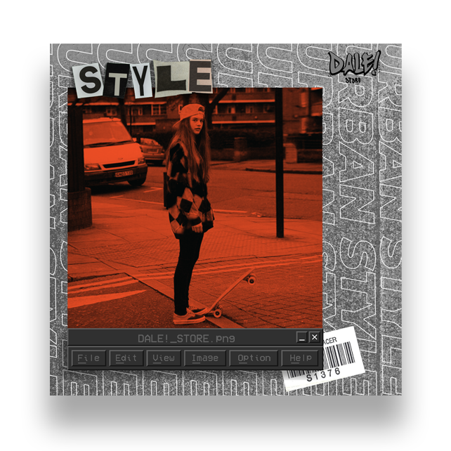
Nas redes sociais da marca nós usamos uma identidade única, unindo estéticas de colagem com o design vaporwave. Os conteúdos são mais voltados para divulgação das novas coleções de roupas.
SOCIAL MEDIA
In the brand’s social media profiles we used an unique identity, unifying the collage aesthetic with the vaporwave design. The content is mostly focussed on the advertising of new clothing collections.